
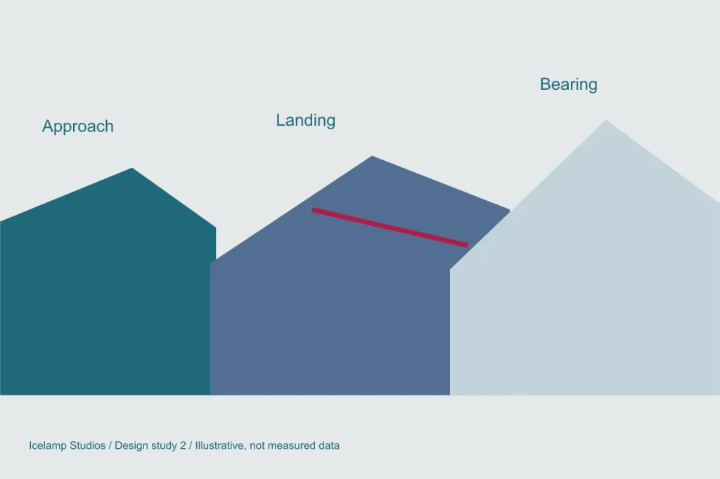
A glacier wall can be beautiful and still fail as a place to navigate. Blue ice, white snow and reflected sky share similar values, especially when a scene is reduced to a small screen. In a game about crossing rifts, that ambiguity affects decisions: a distant ledge might appear adjacent, or a shallow recess might look like a route. This note describes a proposed visual study for separating depth from decoration in the Icelamp concepts.
Give each distance a different job
The foreground should explain the place where a decision begins. A firm edge, a visible approach and a stable reference object tell the player where the mage is standing. The middle distance contains the candidate landings and therefore needs the clearest comparison. The far distance supplies orientation and atmosphere. Treating all three layers with the same detail and contrast would make them compete for attention instead of helping one another.
In the proposed composition, a dark near wall overlaps a pale shelf across the rift. A narrow band of exposed ice runs through the shelf and continues into a recognisable landmark. The overlap establishes order, while the band helps the player identify the same surface from another angle. Fine cracks remain secondary. They can enrich the material, but they should not be more visually prominent than the edge that determines where a crossing ends.
Test value before colour
Our palette uses teal, steel blue, pale grey and a small amount of crimson. Those colours establish the world, but navigation cannot depend on a visitor distinguishing every hue. A useful review begins with a greyscale version of a scene. Can the departure shelf, the gap and the far landing still be separated? If not, adding saturation is unlikely to solve the underlying hierarchy. Shape and value need to do more work first.
The same check should be made at the intended display size. A narrow bright seam that looks clear in a large painting may disappear on a phone. A small route marker can merge with a textured wall. The answer is not simply to enlarge every detail. We should identify which few cues support the decision and simplify the surfaces around them, leaving enough quiet space for those cues to survive reduction.
Avoid a diagram that replaces the world
There is a temptation to solve every ambiguity with an outline, arrow or distance label. Some interface support is useful, particularly during inspection, but permanent annotation can make the environment irrelevant. The proposed approach lets the scene communicate broad relationships and offers precise information when the player asks for it. A selected landing can reveal its usable footprint without outlining every ledge in the entire glacier.
Camera movement also needs restraint. A dramatic sweep may briefly explain the gap but leave the player facing a different composition when control returns. Ideally, the view used to make the decision should be close to the view used to act on it. Small adjustments can reveal occluded edges, while a reset command can restore a known framing. These are prototype questions rather than commitments to a final camera system.
Review the return view
Depth cues must work in both directions. A passage that is obvious on the outward journey may blend into the wall when approached from its far side. For that reason, a future scene review should include paired views of the same crossing. The anchor, landing and landmark should remain identifiable, even though their relative sizes and overlaps change. A remembered route should reward attention rather than require memorising a completely different picture.
The anchor note explains why these distinctions matter before a spell is cast. The larger Quiet Thaw concept adds another demand: surfaces must show change over time without losing their identity. The goal of this study is therefore modest but essential. A player should be able to tell where a path goes before deciding whether to take it.