
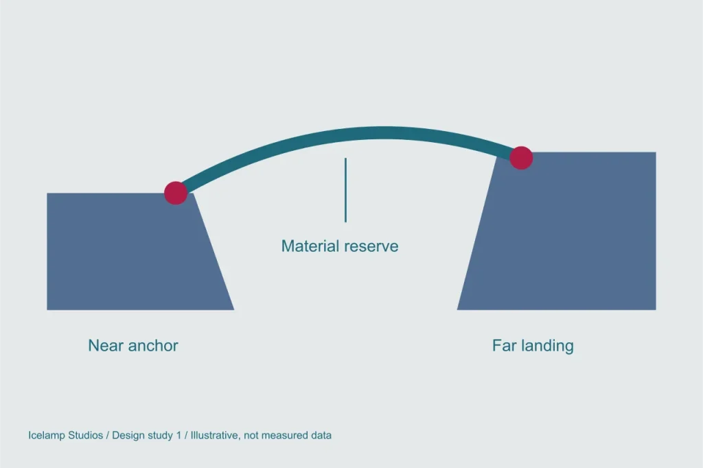
The most important part of a bridge may be the surface it touches. In the Rift Lantern concept, selecting two anchors is intended to be a deliberate act of reading the glacier. If every ledge accepts every spell, the environment becomes a decorative backdrop for drawing lines. If only one ledge works, the decision becomes a search for the designer’s hidden answer. We want a small number of plausible choices, each with consequences a player can understand before committing.
Start with an asymmetric gap
Consider a proposed test scene with a broad departure shelf and two far ledges. The lower ledge offers a short span but little turning room. The upper ledge requires more material and has a better view of the next passage. Neither needs to be labelled as the correct solution. Their shapes already suggest different advantages, provided the camera gives enough information to compare them. This scene is a design proposal, not a report of a completed playtest.
The departure side matters too. Placing the near anchor close to the edge shortens the span, while setting it farther back may produce a more forgiving approach. That distinction gives movement and construction a shared vocabulary. The route begins before the visible gap, and a safe landing continues beyond it. A bridge preview should therefore show the usable approach and exit, not only a luminous line between two points.
Support needs more than a colour
A valid anchor could be indicated by a broad, continuous band in the ice. A doubtful one might sit on a visibly separated plate. Colour can support that difference, but it cannot carry the entire message. The proposed visual language combines a distinct outline, a local surface pattern and a short description available during inspection. Sound may reinforce the selection without becoming the only way to know whether it is usable.
There is an important boundary between uncertainty and missing information. A player can reasonably accept a route whose landing is narrow. It is less reasonable to punish that choice because a hidden support value was lower than expected. The prototype should explain the relevant limit at the moment the choice is made. If the player cannot say what was traded away, the feedback needs revision before the level becomes more complicated.
Preview the consequence, preserve the decision
An early preview can show the footprint of the bridge, the frost it will consume and the space remaining on the landing. It need not rank every possible solution. A single overall safety score would collapse several interesting differences into one number and encourage selecting the highest value. Separate cues are more useful: material cost, landing width and exposure can remain distinct so that the destination determines which matters most.
The commitment step should be unmistakable. Moving an inspection cursor is not the same as casting a spell. A clear confirmation action, followed by visible formation from each anchor towards the centre, gives the player time to connect the selected supports with the completed structure. The animation should be short enough not to become a repeated interruption. It exists to explain a relationship, not to hide an unresponsive control.
A useful first evaluation
For a future prototype, we would ask someone to describe both candidate crossings before choosing one, then explain the choice after reaching the far side. The observation of interest is whether the expected benefit actually appears in play. If the upper ledge promises a better view but reveals nothing useful, its extra cost is empty. If the lower route is always sufficient, the broader landing needs a more specific purpose.
This question connects directly to Rift Lantern’s core loop. It also depends on how depth is communicated, because a landing that looks flat and distant may be judged differently from the same geometry shown clearly. Before adding more spells, we want these two anchors to support a choice that can be seen, understood and remembered.